Both Classic and Modern: How Was This Century-Old Store Designed?
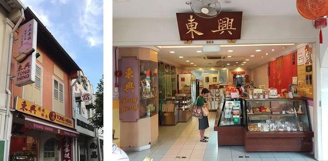
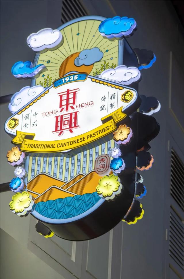
Tong Heng, established in 1935 and operated by a family, is a traditional pastry shop in Singapore. The founder was a Chinese immigrant from mainland China.
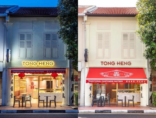
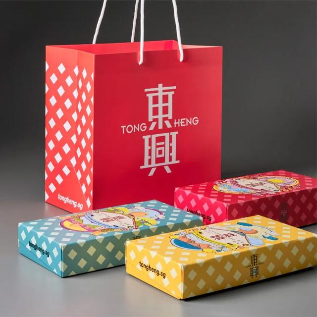
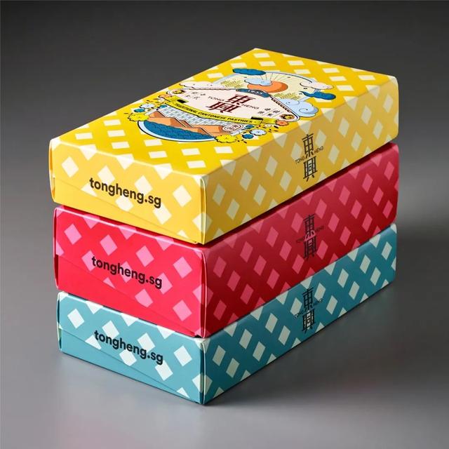
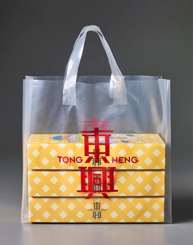
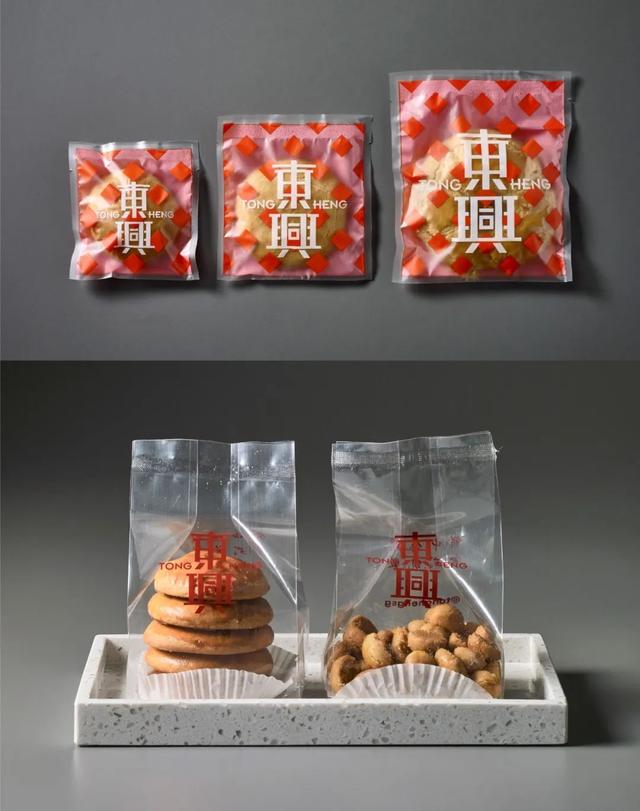
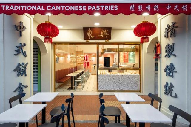
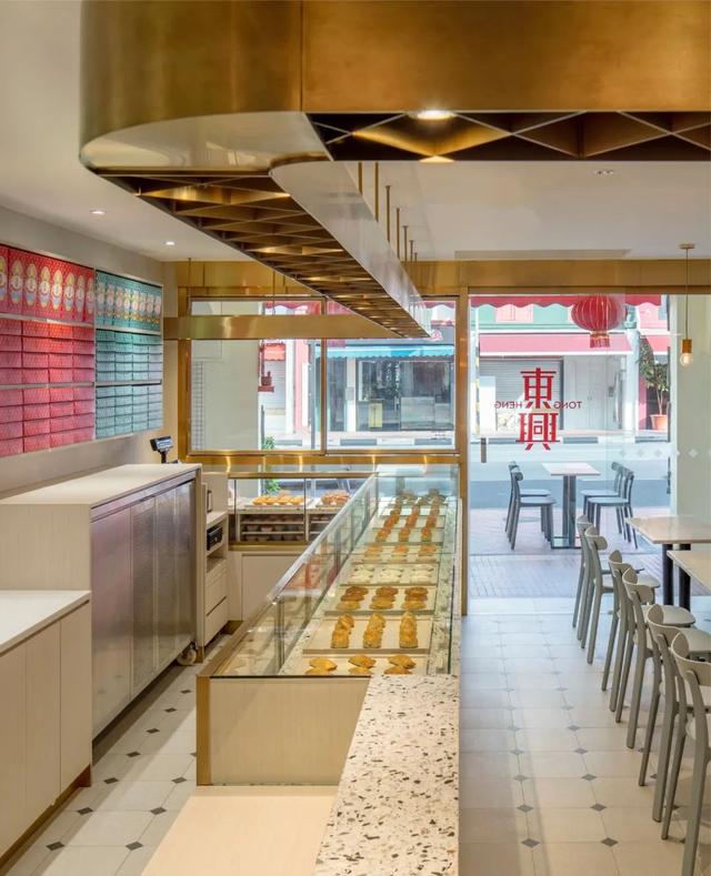
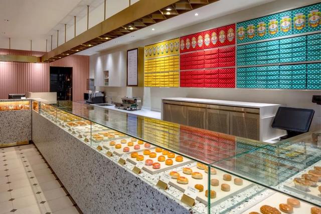
With a long history, Tong Heng specializes in producing traditional Cantonese pastries, renowned for its iconic diamond-shaped egg tarts. It operates two stores in Singapore, and boasts a 90% handcrafted production rate, with ovens being the only machines used.
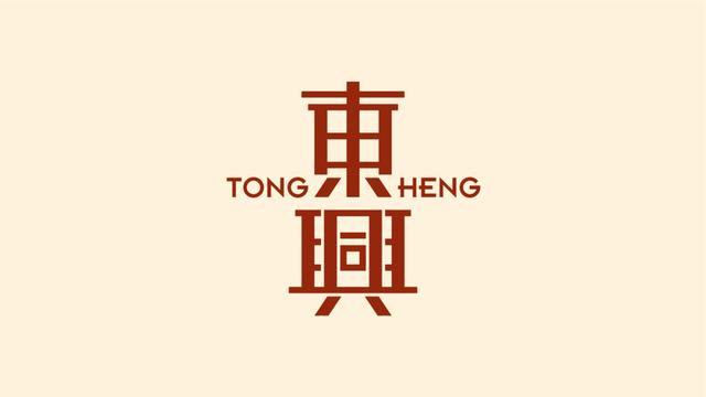
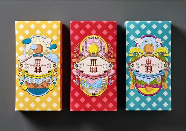
The new logo of Tong Heng is designed by Singapore & Larry studio.The branding of Tong Heng follows the original design, undergoing a comprehensive optimization for modern needs.The brand essence of Tong Heng is summarized as ‘Joy in a Bite (Joy in a Bite)’ with ‘’ (a bite) incorporated into ‘JOY’ ().
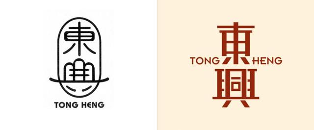
The redesigned old brand instantly regained vitality, while the accompanying calligraphic design also exudes a traditional Chinese aesthetic.

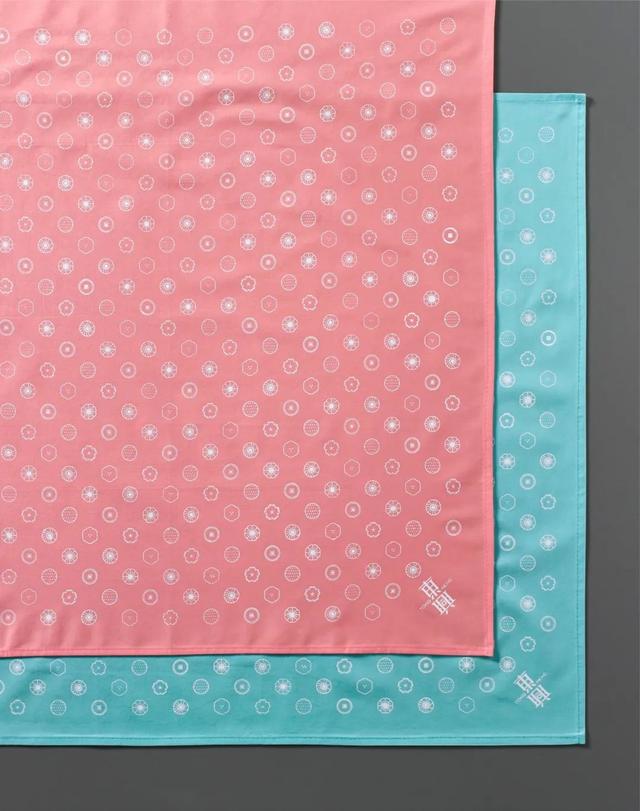
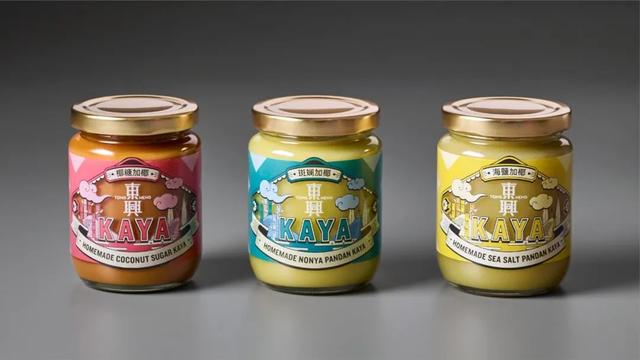
Although the main logo uses traditional red, other applications boldly introduce fashionable light pink and light blue, making the old brand feel softer.
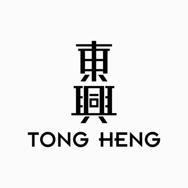
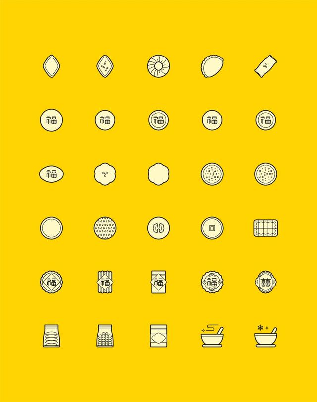
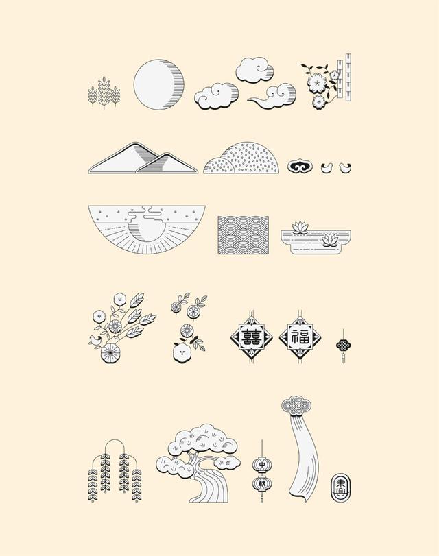
Despite the fashionable colors, specially commissioned Chinese illustrations ensure that the traditional brand continues to uphold its heritage.
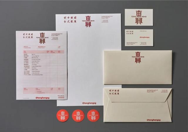
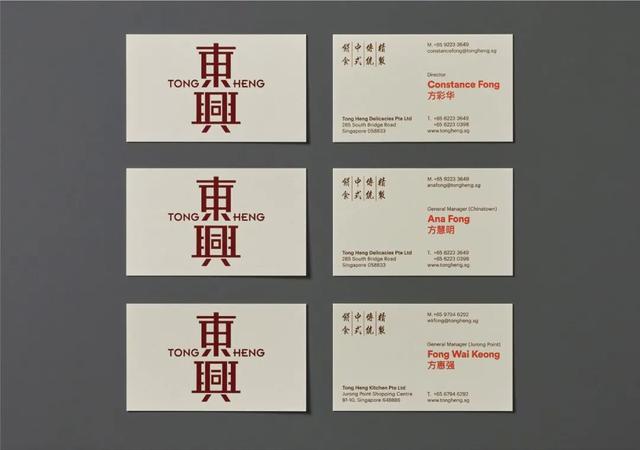
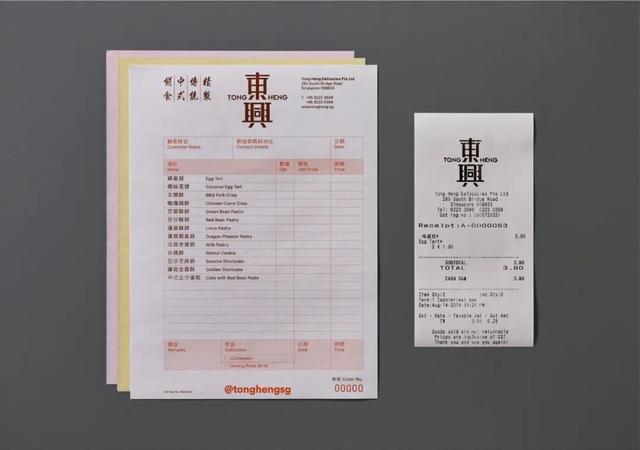
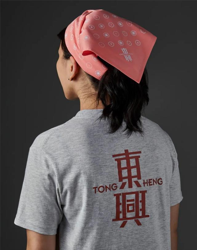
Image courtesy of & Larry studio.
Copyright belongs to the original author.
-
Brand Beauty (ID: pinpaimei)
Promoting Brand Aesthetics and creating a visual feast.
ID: pinpaimei